Sunday, 15 April 2012

Project Evaluation


Evaluation of Image Manipulation Project.

In the beginning, after reading the Image Manipulation assignment brief, I was eager to get started and begin using Photoshop to create images using different medias and formats such as scanning or drawing. After beginning the artist research I quickly found out that the use of an online blog was not to my taste, in my opinion it goes against the traditional format of a sketch book. Blog aside, I started to enjoy the creativity and limitless feel which the image manipulation project brought with it. I tried to cover everything in the brief; scanning items in that I had brought in from home and then using them in various ways on Photoshop. The highlight of the project, for me, was the printing of the final Inkjet piece, I was very excited to see how it would turn out, and the Epson Stylus Pro Inkjet 4880 did not let me down. The quality was flawless, I perhaps would have preferred it to print on the entire page, leaving no white border whatsoever, but other than this, I do not have any serious issues with the finished product. One thing which I found hard was thinking of an idea for my final image, I seemed to not take a fancy to any of the artists/graphic designers I researched. Once I had found the. Geometric work, however, I settled with that particular style. I feel as if this project, because of the dominating use of computers, has not required as much work with other people in the group, when compared to previous assignments. Things which I feel I could have done better in are the following; I need to do a wider range of research which covers all aspects of the work set. Concentrate and read much more thoroughly through the assignment briefs, this will give me a better idea of what I have to do. Lastly, get more involved in tasks set by lecturers, doing everything they ask. One occasion where this was a problem was when I needed to bring in items to scan and use on Photoshop, unfortunately I completely forgot. This is what I need to do better in the future. I am confident with the writing asset of the project, English being one of my stronger attributes. I am looking forwards to the next project of creating a book and aim to put my all into it. 

Friday, 30 March 2012

Final Inkjet

My final inkjet piece. I am, overall, very happy with how this image was turned out. I was told by my lecturer how to use the blending options in Photoshop, this allowed me to create the different opacities throughout the piece. A fair deal of the color I put into this image in the first place has been removed, the drawing of the house being more visible, but most has been sustained and resides above the building sketch. Even though it's my final, I didn't spend much time combining the geometric shapes and the drawing together. I thought about adding something more but quickly decided that it would get too busy and cluttered. I think I have achieved something which is of a psychedelic, brightly colored nature but does not verge on the edge of being tacky. It could be said to be a mixture of Rachel Duckhouse and Monika Grzymala's geometric / line work with the architectural drawings of Mies Van der Rohe. I am very pleased with the result and would like to do more of this style.

Screen Shots

First of all I scanned and imported a drawing of a building I had previously drawn into Photoshop. I scanned  it using the black and white settings which resulted in the optimum quality and most realistic replication of the actual drawing.
Once I had my drawing on Photoshop I imported my geometric design onto to the same project. I then opened the Blending Options using Layer > Layer Style > Blending Options. By using these blending options  I was able to create all manner of different effects. It changes the transparency and opacity of certain colors. 
Here is the finished piece, it is a very abstract image, I altered the contrast on the hand drawn building to make it look more funky and textured. I will now write a small evaluation on the piece. I am happy with how it has turned out!

Geometric Lines

Inspired by some of my recent artist research, I decided to try and create my own digital artwork using only straight lines and color. I wanted to make something similar to Monika Grzymala's work, but, as I have said before, with more organisation and conformity. To start with I opened an A3 document on Photoshop, and selected the grid by clicking View>Show>Grid, and then enabling snap to grid by clicking View>Snap To>Grid. I then began to freestyle with lines on this page. After about an hour of drawing, with over 600 layers, I came up with this.
I quite like what I have done here but I think that it could do with something more, perhaps some color. After deciding this, I started to add color using the paint bucket tool. I wanted to make transitions of color all over the image so I had to fill in each small quadrilateral, triangle within the piece. It took me a very long time to add the desired color onto it but after about two hours of Photoshop work I came up with this result.

I didn't want to fill the entire thing with color as this would have been overpowering. The transition effect has worked well in this, my favorite section being the red/black on the left. I want to use it for my A3 Inkjet final but I need to merge it with something else.

Rachel Duckhouse

Rachel Duckhouse is another graphic designer I have recently found, and I am also extremely fond of her work. The form in which she produces these designs generally follows a vague trend but without the precise measurements and exact dimensions which I prefer. This piece, called New Work, shows the typical style which Rachel follows, the minimilistic colors offer a subtle resulting image, understated yet effective. I am not sure whether the work is based on anything, or is just a free style experiment each time. I would like to imitate certain aspects of her work, but do not want to create an image this busy.

Thursday, 29 March 2012

Monika Grzymala

I was browsing through artwork created by just using lines and other geometrical shapes when I came across some unusual work by an artist called Monika Grzymala. The pieces produced are three dimensional, in exhibitions and are very abstract, one of my favorites being the creation, Miles and Miles of Sticky Tape, pictured above. They are usually black and white, very rarely are they made in color, except for a few examples. I like the contrast between the blacks and the whites, and the way in which it can be viewed in any direction, giving off a different idea from every angle. I would like to create something similar to her work, except with more guidance and less of the wildness. My work will also be two dimensional and created using a digital format, to assist the desired conformity.

Tuesday, 27 March 2012

Pencil Spectrum

Just a little color testing with a pencil I found online. I cut out the pencil and then copy and pasted it about 30 times so that I was able to have a steady transition of colors.

Finished House

Here is the finished image, I quite the like the colors I have used, I chose them at random and tried to seperate similar colors as much as possible. The building design by Mies van der Rohe looks, in my opinion, better here than it does in the photo. Because of the accuracy I have traced the original picture with, it has a professional feel to its understated, quite structure. I added the color using Photoshop, but simpler programmes such as MS Paint would be as sophisticated. I will use this as one of my final images.

Screenshots 3

Here is the finished drawing, the colors are now to be added. I only used bright colors to make the image more appealing. I went for an abstract, wild color scheme. I clearly show where the Paint Bucket Tool is located.

Screenshots 2

Here is the drawing coming together, I have clearly shown where the Line Tool is located on the toolbar. As you can see some of lines in the drawing are weighted 2px, wheras the majority are just 1px. I like the look of the steps up to the building.

Screenshots


To start with I began to draw the main edges over using the Lines tool as shown in the picture below, this allowed me to create an accurate, architectural drawing of the building.

Mies Van der Rohe

Today on google, an architect named Mies Van der Rohe was honored with a google doodle. I researched his name and found some of the buildings which he designed. This one struck my eye and I loved it at once. I have decided to use it in one of my final images. I plan to import it into Photoshop and draw over the main frame of the building using black lines of different thicknesses. I will keep the blog updated using screen shots.

Monday, 26 March 2012

Word Shapes

I like the idea of creating an image just using words, to do this I would start off with an image of the thing I wanted to create, and then make many word layers to fit onto the background layer. After I have filled it up I will delete the background layer leaving the new image. It is a bit like digital tracing.

Karol Kolodzinski

Karol Kolodzinski's work is absolutely breathtaking! The amount of work that goes into one of his pictures is truely incredible. He uses bright colors, a dazzling array of brushes and his images somehow work. This is a favorite of mine, I like the contrast between the man who, on first impressions, seems a horrible, frightening fellow, and the childrens toys. The way it has been displayed could represent memories coming from inside him, escaping. The sun glasses and the suit show how he's representing himself, these clothes are often seen as the city's uniform. You can see the city beneath, and the ladder shows his escape to the heavens, and the flood of colors and thoughts is him letting himself go, unloading stress. Kolodzinski's work would be very hard to recreate because of the intricity of it.

USA Flag

This is a flag I created for my Diorama project. I thought I would add it onto my blog as the production of the image used a number of different image manipulation techniques. To begin with I drew out a very accurate American flag with all of the correct dimensions which I had previously researched online. Once I had my colorless pencil drawing correctly scanned in at a high resolution and imported into Photoshop I began to find the right colors to use. I found an image of an American Flag online and then, using the eyedropper tool I selected the red from the stripes and, using the paint bucket tool, filled the correct stripes in. I then made the union of the flag the bright blue that is used in reality. The stars were harder as they were the color of pencil lead. To correct them I had to set the tolerance of my paint bucket tool to a low number, the tolerance defines how similar in color a pixel must be (to the pixel you click) to be filled. I made the stars completely white to replicate the real thing. I am happy with the end result and enjoy the technicality and precision needed for accurate flag drawing.

Friday, 23 March 2012

Kid Spaniard is a graphic designer using illustrations that she has created herself. She edits photographs and drawings to make them appear to have been crafted on a computer, but she does this subtely, in a smooth, seamless fashion. The colours used are always very dull, and in some cases almost lifeless. She never uses eye catching colours, the backgrounds, mainly, are almost transperent, showing the commonly used white background beneath.

Tuesday, 28 February 2012

Car

I found a photograph of a smart car on google images which looks like it might've been used in an advert or commercial of some kind. I traced a line drawing of the car to scan into photoshop. Once I had scanned it into Photoshop, I used the paint bucket tool to result in an accurately colored car which could be a real vehicle. I added shadows to the wheels, the door handle, the lights and on the underside of the wing mirror using the burn tool. This adds a lot more depth to the image making it seem far less two dimensional. I will use this as one of my final images.

Monday, 27 February 2012

Psychedelic

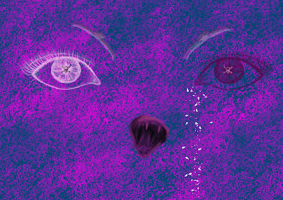
I wanted to create a psychedelic image using several different layers and colors. First of all I used a concrete effect brush to create the texture on the background and then, using a facial features brush, I added the eyes. The eyebrows are in fact birds, flipped upside down and used in several different colors . The mouth, I found in an image from a yawning cat on google, I changed the hue to make it fit with the color scheme of the image. I am not sure which artist's work this is similar to, but I would be interested to find out.

Flower Background

Here is an image I created on Photoshop using only brushes. I was going to try and fill the whole image but when I started to add things to the center of the image, I did not like the result so I removed them. It would be good to use as a background for something, maybe an advertisement.

Friday, 24 February 2012

Tilt Shift


Using the tilt shift on photoshop tool I created the latter image. I also turned up the saturation to make the picture look more like the cars are toys and not real.

Tracing

I took a high key portrait of a baby from google images and was requested to trace it. I put the picture on Photoshop and turned the contrast up so the darker areas stood out more. This would help to make it more visible when put beneath the tracing paper. I then traced the photograph onto the paper and scanned it in.  Here are the results.

Monday, 6 February 2012

Mountainscape

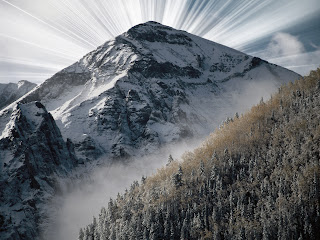
I found this very common mountainscape on google images. I searched for a large resolution picture because they always look nicer. I wanted to use the sun light tool to create a heavenly effect around the mountain.

First of all I made a duplicate layer so if I made any mistakes then I could always delete the layer. I slightly saturated this layer so that the colours did not stand out as much. I then used the quick selection tool to select the mountain and trees but not the sky. I then copied this in to a new layer. After this I used a downloaded brush called sunray selected the brush colour as white and selected the duplicated background layer and then added some white sun rays behind the mountain. This is the result.

Cloud

Here is a cloud scene I created using only brushes. I was just experimenting on photoshop with a cloud brush and decided to add some sun rays coming from the top right. This was difficult because I had to make sure the shadows were on the correct side of the clouds in unison to the sun. 

Kelsey Drake

I really like Drake's work. She creates very strange images that look like they have been drawn, scanned in and edited on photoshop. I have linked a strange image, a pregnancy test stabbed into a human heart. The human heart is often considered as the thing which determines if the host is alive or dead, depending on whether it is beating or not. The pregnancy test also decides whether thousands of babys will be born or aborted every day.

Friday, 3 February 2012

Photoshop messing

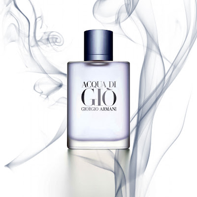
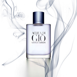
This is a little experiment I did on Photoshop cs5. I took an Armani advert from google images and then added smoke and changed the hue of the colors slightly. I wanted to achieve an end result that did not look too overdone, without too many effects. I like the result.


Tuesday, 31 January 2012

http://www.sa-design.co.uk/history.php

A great website with a lot of interesting graphic design work for large companies. Mainly logos made on request by businesses.

Test


Just messing around on photoshop and was using an arrow tool which produced this result, I turned the image 90 degrees clockwise and it looks a bit like a group of densely positioned trees.